Hi everyone... Today I feel like want to discuss a few facts about colors. Just look around you and you will see everything around you fill with color, like your shirt you wear right now.
For your information, color will affect every facet of our lives.The way we react to colors is a combination of physiological, biological, psychological, social and cultural reasons.
So, here are a few fact of colors:
RED
The Hottest and the most dynamic color, red is activating, stimulating, passionate, exciting, powerful and expanding.

Where to use:
Use minimally in its purest form as an accent to draw attention to critical elements.
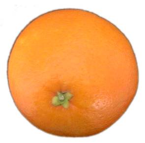
ORANGE
Not as overwhelming as red, orange is a balance color that is vibrant and energetic while being friendly and inviting.
Where to use:
To give a friendly and inviting impression.
YELLOW
The brightest and the most energizing of warm colors, yellow is happy, warm, stimulating, and expansive
Where to use:
To give an impression of happiness and cheerfulness.
GREEN
This cool secondary color is calming, balancing and rejuvenating. Green represent stability and inspires possibility.
Where to use:
To represent balance and harmony in design.
BLUE
Blue represent dependability, trustworthiness and security. It can also characterize calm and spirituality.
Where to use:
Dark blue are excellent to corporate and business design.
Lighter blue can be used for social website that represent calm and friendliness.
PURPLE
Represent nobility, abundance and dignity, but can also stand for creativity and imagination.
Where to use:
Dark shades of purple characterizes wealth and luxury.
Softer shades can associated with spring and romance.
BLACK
Black represent power, elegance and modernity, can also characterizes mysteriousness.
GRAY
Represent neutrality and calm. A lack of energy can be associated with conservative design.
BROWN
Represent wholesomeness and reliability. A stable color, brown can be associated with experience and comfort.